PROJECT DESCRIPTION
This logo is for a woman creating a wellness business. She is focused on wholistic personal training.
She wanted a logo that balanced the strength and nurturing qualities of many women. She liked the color purple so she decided at the beginning that it would be the main color for the brand.
She was not set on the company name at the beginning so her name is featured for the early drafts. After taking a style quiz and a joint Pinterest board, I learned her personal style is earthy and boho.
THE EARLY DRAFTS
The drafts created at the beginning show the idea of strength. She had many different ideas that I tried to work into one design.
I wanted to balance the strength with femininity by adding strands of hair. My other idea was to play off of her last name with the bubbles. Obviously these were not what she was looking for, nor was I satisfied with them.
THE SECOND DRAFTS
Before the second drafts, she mentioned that a floral piece would be preferred. I worked around the lotus as it is known for being a symbol of health.
These are much closer to the idea she was thinking of, but they are complex and will have a hard time being recognizable once broken down into black and white.
THE FINAL LOGO
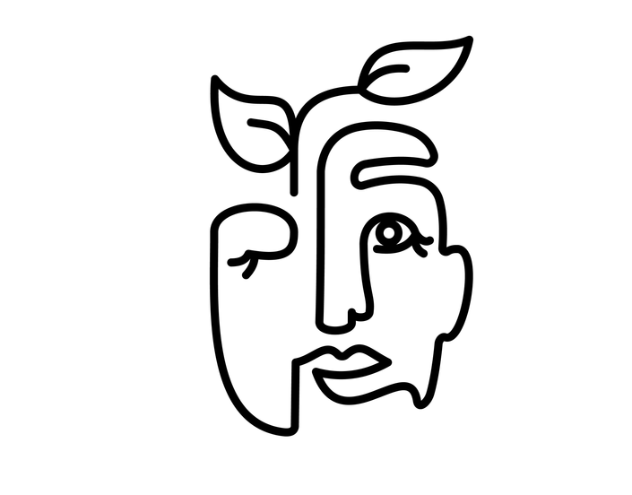
The final logo captured the earthy style she wanted and the wholistic values she holds. She believed this would allow her to branch out from physical training to other areas of health easily, as the logo does not feature weights.
She liked the typography chose, as it matches the logos qualities of femininity and self assurance.


