ANAKTO APPAREL
BRAND DEVELOPMENT
COMPANY DESCRIPTION
For my senior exhibition, I am creating an apparel company that features feminist ideals. Not every woman is the same, and it should be celebrated. I would like to make statements to validate those who are seen lessor in the media, for example women in the lgbtqa+ community, women with disabilities, and women with more masculine style.
The company would be for all women so I would like to give a feminine underpinning to the company. The clothes will be basic lounge wear, including some accessories. The company would be for the everyday middle class feminism supporter.
COMPANY NAME IDEATION
.png)
The company is Anakto Apparel. I believe the word is neutral. Anakto is a Greek word that means to retrieve, in this case I am using it to mean to retrieve rights. This word is more powerful than the others in this mind map, as it works with the topic. There is also no company named Anakto Apparel, making it available for me to use.
Note: the company was originally named Alpas Apparel, but during the production the name was chosen by another company. This is why Anakto is not on the mind map, as it was thought of later in the design process.
MOODBOARD
LOGO CREATION


I began the process of making the logo by finding typefaces that fit the feel of the company. I chose to go with a san-serif, as it is clean and beautiful. I broke down the structure of the "a" from each typeface, so that the "a" logo would match the type.
I used color boards to test different colors. I am drawn to the vibrant color schemes as they have pop.

The
BRAND GUIDELINES
ANAKTO APPAREL
THE BRAND IMAGE
Creating a comprehensive clothing line that invites, accepts, and encourages feminists of the modern era. Anakto Apparel is dedicated to upholding values of equality, avoiding slave labor, and producing high quality apparel with eco-friendly measures.
Passionate, Persistence, and Empowered
Passionate - lively "in your face" culture
Persistence - Not backing down from controversial topics
Empowered - Messages that build up the feminist cause
OUR LOGO
Anakto Apparel's logo is the abstract of the a's within the company name. This mark not intended to symbols an object or idea in relation to becoming free, rather just the type creating an intense strength.
This logotype has been custom designed and must not be recreated. Do not attempt to set type. Do not change the weight of the letter forms.
TYPOGRAPHY
CERA PRO
Bold
Medium
light
A B C D E F G H I J K L M N O P Q R S T U V W X Y Z
a b c d e f g h i j k l m n o p q r s t u v w x y z
0 1 2 3 4 5 6 7 8 9 ! @ # $ % ^ & * ( ) _ +

LOGO USAGE
-
Do not change the spacing between the letters
-
Do not change the typeface used
-
Do not add effects, example a drop shadow
-
Do not distort the logo
-
Do not place the company name below the icon
LOGO CLEARANCE
logo clearance should be twice as the 'a' in respect to the size the logo is featured.
MINIMUM SIZE
The minimum size for the primary logo .2 inches, as the mark should be recognizable at all times.
COLOR PALETTE
WISE
PASSIONATE

LOYAL
PROTECTIVE

RGB: 238, 52, 125
CMYK: 0, 92.81, 19.99, 0
Pantone: 1915C
#EE347D
RGB: 177, 66, 152
CMYK: 31.32, 88.45, 0, 0
Pantone: 674C
#B14298
RGB: 64, 198, 235
CMYK: 61.84, 0, 3.68, 0
Pantone: 305C
#40C6EB
RGB: 25, 129, 196
CMYK: 81.91, 41.33, 0.04, 0
Pantone: 7460C
#1981C4
ROLE OF THE BRAND
Brand guides are a set of visual elements that represent our brand. They include: Name, Logo, Color, Type and Usage. When used consistently these elements create a cohesive identity for Anakto Apparel.
The role of Anakto Apparel guidelines is to provide customers with the most effective way to remember and recognize us. They will be able to recall who we are, what we do and the service we provide. Our brand identity differentiates us from our competition, when used properly it will contribute to the strength our brand.

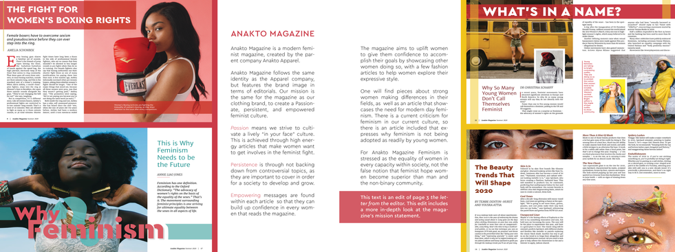
ANAKTO MAGAZINE
EDITORIAL DESIGN PROCESS
Anakto magazine features feminist articles to produce a culture of thinkers aware of influential female, or gender non-conforming leaders. The target audience is feminists in their 20's to 30's, so the look of the article will be playful and colorful to draw in a younger crowd while maintaining a classy feel.


